What is Layout.DEV ?
By Mads Stoumann on 03-11-2022
If you are a content creator, you have probably worked with components (AKA chunks, blocks etc.). Many with the exact same content, just styled differently.
It could be a card component with a tagline, an image, a headline, some text and a button.
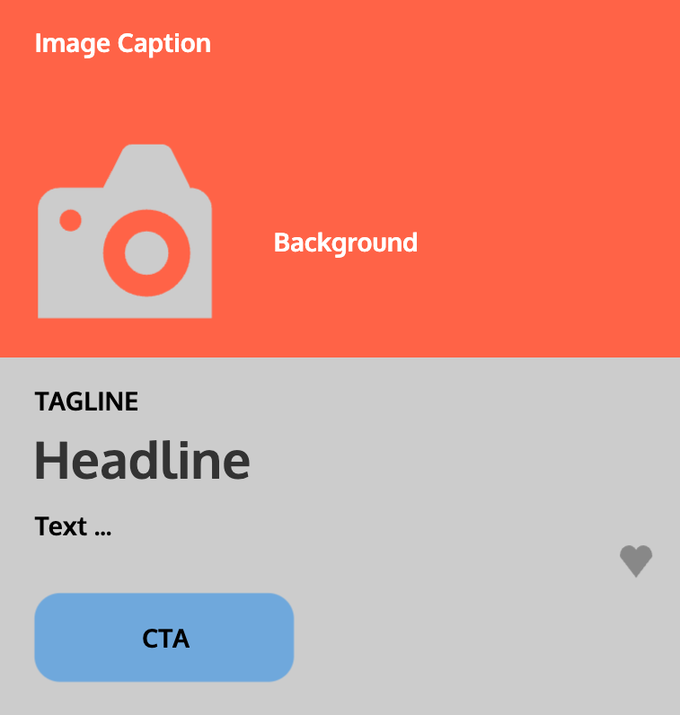
Likely, the developers have delivered you a version where you can choose - from a dropdown — whether you want the image above or below the content.
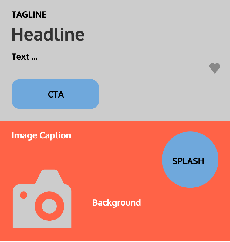
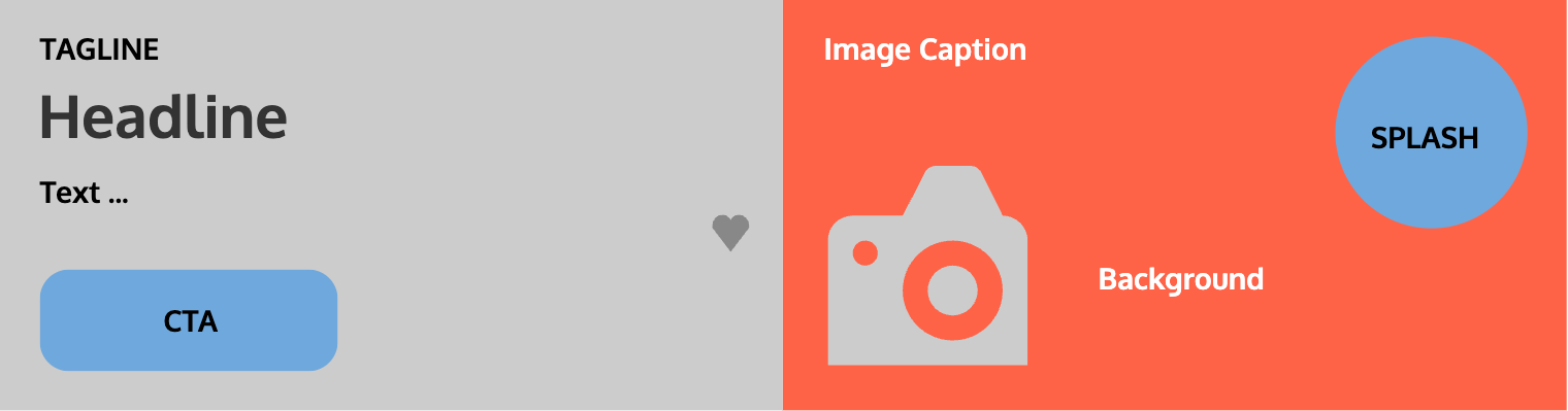
That worked fine for mobile. For larger devices, you also want a version, where you can place the image to the left or right of the content. You would also like to combine these in all possible ways. So, you can use the "image above"-version on mobile and "image-left"-version on tablet etc. As a result, the developers end up adding a bunch of dropdowns to the CMS. Chaos ensues over time and your CMS feels clunky, messy and slow to work with.
Picture this. For a new campaign you need a hero component. You discover the content for the hero and your card-component is exactly the same. You ask for new updates to the card-component, and the developers add yet more dropdowns.
One day you find out the card component can also be used for small previews of articles. You just need better control of headline-sizes, and the option to style the button differently. You guessed it… The developers add more dropdowns to already complex user interface.
Ok, you get it. It doesn't have to be this way. Instead, imagine a new Content Creator being added to your team. It will take a lot of time to get this person up-to-speed with all the options available. And, this person might just also have a few ideas for expanding the card component.
What if you and your colleague could trash those dropdowns altogether? What if the developers could spend their time developing brand new, existing and revenue impacting stuff instead?
Imagine a visual tool, where you can move stuff around, chose new font-sizes and colors (from your brand style guide). You can create infinite versions of the card component without all the dropdowns and chaos.
This is the core of Layout.DEV.
A visual editor for Content Creators. With roles, so your team can collaborate without the risk of ruining each other's work.
Version control enables you to create, store and share components as named presets. For example, the hero component mentioned earlier, could simply be called "hero" and be used as a read-only version by one of your team members.
Oh, and let's not forget how easy it is to bring your work to production. There's no need to deploy any code or wait for the next release cycle. Simply publish your component and it is good to go.
Now, as Uncle Ben said: "With great power comes great responsibility".
If your role is "master of the universe" (or similar), you'll have the rights to centrally update all versions of a component. Again, without code-deployment. This can come in handy, if you want to update all card components with the hero-preset to "orange-text-on-black-background" for Halloween.
Layouts
So — you've been using the card component for almost all content on your site, but you find the 1- or 2-column layout of the site quite boring. The developers are using specific page-types and sections, so you cannot freely put anything anywhere. In other words: You don't have that flexibility that you have grown accustomed to with the card component.
You ask the developers to build a section component, that can wrap your card components, but allow you to choose the amount of columns, add background-colors etc.
Before you know it, you have a component with a bunch of dropdowns, just like that initial version of the card component.
Conclusion: You need a visual editor for the section component as well!
This is another one of the things that Layout.DEV does: Building custom editors.
We call it Component Designer. To build a custom experience is super-easy, but we recommend it being a collaboration between a Designer, Frontend Developer and Content Creator. That way, everyone can agree on markup, structure and possibilities.
Thankfully, this is easy to do in Layout.DEV and helps everybody stay aligned on brand yet independent giving your team pace and agility.
Components and beyond
Now, let's go back to the card component. Even though it's a very> flexible component, your site will need other components as well. Some of them will be super-simple, other quite complex.
For the not-so-simple ones, use the Contend Designer to quickly build a state-of-the-art experience for Content Creators. Add constraints, if needed — or allow creative freedom — without deploying new code.
A visual editor will always be easier and more intuitive to use than a bunch of dropdowns.
And that's the goal of Layout.DEV: We want better experiences for Content Creators.